We are Antier:
Our Brand Story
This is how we
express ourselves.
Our brand is not just
a logo. It's how people
connect with us and
our services.

Our logo is our flag
It expresses us. And when we
use it the right way, people
can recognize us at a glance.
First Thought
New world.
New generation.
New technologies.
New business models.
New vision.

The above chain of 'new' motivated us to embed our new
vision into our brand identity. The blockchain is the DNA of
new Antier, so we started with the basic thought, i.e. for us
everything is a block. So all our brainstorming revolved
around the term 'Block'.
Process
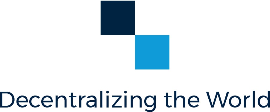
The new Antier logo represents change, growth, and a brighter tomorrow. To embed the soul of the blockchain, we played with alphabet "t" in "antier", which represents a chain of two blocks. The two blocks use a simple and elegant aesthetic that will remain bold for a long time and be instantly recognizable.
Sketching
Type & Concept Exploration
Our Colors
Embracing a much more colorful language in our brand communications, Antier Blue is our resting colour, used only in situations where the brand palette is not being used. We have chosen vivid sky blue to represent trust and deep blue to represent bold youthful personality of our brand.

Deep Blue*
#002341
R0 G35 B65
C100 M83 Y45 K51

Vivid Sky Blue*
#0f9bd8
R15 G155 B216
C76 M24 Y0 K0

White*
#ffffff
R255 G255 B255
C0 M0 Y0 K0
Final Logo
Exclusion Zone
The logo and the icon’s exclusion zone is equal to half the height of the icon (marked as × in the diagram).

Minimum Size
Establishing a minimum size ensures that the impact and legibility of the logo is not compromised in the application.
![]()
The Antier logo should never be smaller than
184px in digital or 65mm in print.
The Antier icon should never be smaller than
52px in digital or 18mm in print.
In Advertising
The visual identity gives a cohesive look across different advertising avenues.

In Advertising
Design for a possible brand application.